Saturday, June 27, 2009

"Drawing" as an artistic evolutionary statement - using C. Darwin in steps

Charles Darwin

click on image to see all steps enlarged

Evolution as an Art Statement. The Figure Network believe in the idea that art should evolve as we approach new times and that we should set an example to the upcoming art generations, and of course...it should begin with the figure. In here I am using Charles Darwin portrait as a symbolic statement for this purpose in basic drawing steps.

For basic steps refer back to: The Power of Objective Observation

Don't forget to join The Figure Network in facebook at:
http://www.facebook.com/pages/Tampa-FL/Figure-Drawing-and-Painting-The-figure-network/89787403008?ref=nf

Monday, June 1, 2009

Using "alla prima" moving into abstract expressionism contemporary portraiture

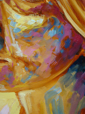
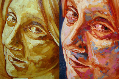
Portrait of my wife at age 29
oil on canvas

Alla prima: a painting technique in which a canvas is completed in one session, often having a thickly applied impasto.

As we move into a more creative approach with the figure sometimes it is hard for the contemporary fine artist to find a way to express or align with modernism.

I find Alla Prima a temporary effective and strong solution as far as the medium is concerned. Why temporary? Well, it is only my opinion, but it could only be stage or period in the artist's career to move on. This is only an aspect of creativity, but a great ice breaker for style development that will open the door to many possibilities in you art.

Alla Prima is just like the concept of gesturing with graphite, only this time with paint (also works great with acrylics)

In here, once you have your under painting applied onto the canvas you can use it effectively for your advantage, which could be most of the colors that will be associated with your painting.

The benefits

A strong solid painting style application foundation is the essential benefit of this concept.

For those fine artist interested on abstraction (even non-objective)this is the exercise for the comprehension of abstract approaches (I strongly recommend to review the Abstract Expressionists at the beginning-mid of the 20th century and why they did it, and their influence in today's art)

The steps

When selecting what to paint, specially where the figure is related, think about the fact that the more drama you create on your subject the more effective and impacting your painting will be.

Choose a subject with high chiaroscuro, in other words a subject with high contrast and variety of tones and values.

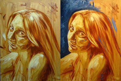
After your under-painting is ready begin by sketching your drawing foundation straight with your painting brush (burnt sienna or other dark earth color associated with the skin). Don't worry about corrections at this point, feel free to build multiple lines with your brush, you'll correct later as you paint.

Remember, with this concept it is our goal to have any painting done in one session (wet on wet). The technique is forcing you to paint fast with a constant loose rhythm, intense brush strokes and fast decision making.

Begin by building your basic color strokes foundation starting with your darkest values using the value next to value technique (refer to: Principles in painting basic realism)

Since we are not blending the painting should have a painterly effect.

Recommended colors and hues:

  • Burnt sienna (dark and middle tones)
  • Flesh tint (middle and light tones)
  • Naples yellow (light tones)
  • yellow ocher ( transitional value in between tones)
  • Permanent Alizarin Crimson (red) (dark tones)

Moving into Expressionism

As we approach some of the final approaches with this technique you must think about how far you want to take an approach like this one.

In here the creative process and improvisation takes place. After all your value next to value foundation, it is time to make some decisions on color application.

You can choose any colors you want as long as they are well executed. And also you are still playing with traditional color language such as warm – cool concept

The key for a good color execution is your control over color harmony or color distribution. It is really up to you how far you want to go with this technique or how abstract you want to go(don't abuse the color, you should know at which point you must stop)

Don't over due the color!!!!!!!

Color harmony or distribution is accomplished by the understanding and ability to establish foreground-background relationship where the color is concerned. (see the impressionists)

Thursday, May 7, 2009

Get the best out of your contemporary portrait with a classical approach using an effective drawing economy

Portrait of a model

(click on image to view steps)

Pencil on paper

Tonal-cross contour technique


For technical text steps refer back to "
The power of objective observation, suggestion, and economy in drawing (the portrait)"
Here is a quick recap:
Composition
Prediction
Light gesture drawing: no erasing
Shapes
levels and angles
Location
Target point
Association
Distances
Correction: erasing
Line definition: heavier lines
Basic shading foundation
Contrast
Details


Monday, March 2, 2009

The effectiveness of gesture drawing and the power of improvisation

by Darwin Leon

Part 1

Gesture drawing or suggestion in drawing is definitely one of the most powerful tools you will ever use in your lifetime as a fine artist specially when drawing the figure.

What is gesture drawing?

This is the process of drawing quick, lightly without erasing with a constant movement and focused on the subject. The concept of gesturing is the idea of capturing in a suggestive way a sketch of what the brain has already seen. I strongly recommend this exercise in any art class in the planet and in any subject, technique or style. I must say this technique is universal and always works. I personally have found this approach of incredible benefit and developmental in my personal work for years now. For any contemporary fine artist the idea of suggesting in drawing is a powerful, effective and timeless tool.

What is suggesting?

Suggestive drawing is basically capturing a basic main idea of the subject matter in a fast and light sketch drawing.

The benefits of gesture and suggestive drawing

We can almost safely say that these two are totally related. When you are doing a gesture drawing you are basically suggesting. As any other technique in the arts, gesture drawing requires exercise and repetition. Repetition is the key for this exercise success. The benefits and advantages are endless. After repeating this exercise for a long time consistently you will notice a general improvement in your drawing skills such as observation, composition, line quality and proportions. Since you are drawing fast, the circumstances are forcing you to spend more time observing with deep concentration at the subject obsessively with a very objective approach.

Gesture drawing should be used in any situation and any subject matter, even when painting, your initial basic foundation must be done in a gesture drawing. This will save you a lot of time, you will create better compositions and it will become more productive. Gesture drawing is great for figure studies and anatomy as well as sketching on site such as landscapes scenes and still life. It is also great for decision making when drawing and a great builder of confidence as times passes. (see Draw anything and everything)

Your line definition will improve dramatically and your observation skills will step another level. You must become visually obsessive with your subject matter when gesture drawing. Also, you must read every single contour line of the figure and feel it deeply in your eyes until it reaches your mind solidly. Gesture drawing is the direct objective connection of brain-subject matter. When gesture drawing feel free to build multiple lines as you draw. In here you are mapping or brainstorming. In the process of multiple lines draw very loose. Don't waste your time trying to erase, it is not the point at this time. Also, don't concentrate in one area for a long time. The concept of drawing fast with multiple non-heavy lines will give you the flexibility of correcting as you go.

Build lines even for the angles. In this way you are already positioning your figure in the right places, angles and distances. For example, quickly draw a line to position the level position of the shoulders or clavicles and note from your point of view which one is lower and which one is higher. Same for the hip bones, feet angles and distance, and center line for the torso (upper body). Eventually your lines will evolve and you will discover more lines that will help you in the angles and positioning process. Eventually drawing will become more fun instead of an issue.

Adding shapes to your gesture drawing – the improvisation process

I strongly recommend to get into the habit of building shapes when gesture drawing. “Think shapes”. In here you wanna get creative. Gesture drawing and shapes must be married. The effect of shapes in your suggestive drawing creates a very positive result. Instead of always building just lines to achieve line contours, you want to combine it with shapes. These abstract shapes could be from an oval, circle, rectangle, triangle, etc. And the shapes must be associated with the actual forms that you are visually experiencing at the moment. Shaping could also be called massing. This is an extraordinary tool for placement, association and positioning. Along with your lines the shaping process will give you a better idea of what to look for. Not only for the human figure this applies but for anything that you see in nature like a simple apple. Again, this is a repetitive process. It takes some times until you control these shapes in combination with you gesture lines.

In here you are improvising. It is really up to you how far you wanna go with this shapes. The more shapes the more structured your figure will be. And when the time comes to correct, you already have a very strong basic foundation to work from. Remember, there is no way to correct if you don't have something. Shapes applies for everything and it is a great composition detector. When you have a figure or more than one, or multiple complex compositions there is the overall shape. This is visualizing and thinking big. The over all shape will give you the illusion of an abstract shape that encloses all the figures into one composition. For instance, some figures resembles the geometric shape of a triangle like the one showed in this post.

Here is a general basic hint list of what parts and muscles to look when gesturing, suggesting and massing:

  • Head (forehead, eye cavities, nasal bone, mouth, chin, high/low cheek, ears, jaw, upper/back skull, neck-sternocleidomastoid)

  • Shoulders (deltoids, clavicles, trapezius)

  • Chest (pectoralis major, sternum)

  • Abs (rectus abdominus)

  • Love handles (external oblique)

  • Arms (biceps, triceps, forearm extensors and flexors, forehand, fingers)

  • Side body( serratus anterior, latissimus dorsi)

  • Pelvic area – hip bones (visible gluteus medius)

  • Upper legs ( adductors of thigh, rectus femoris, vastus medialis, vastul external or lateralis, femur bone)

  • Knee (patela)

  • Lower legs (gastrocnemius, soleus, peroneous, tibia bone)

  • Feet (ankle, heel, arch, ball of foot, instep, toes)

  • Upper back torso ( trapezius, infraspinatus, teres minor/major, latissimus dorsi, lumbar area, external oblique, deltoid, gluteus medius/maximus)

Tuesday, December 30, 2008

Principles in painting basic realism – The portrait

Portrait of a Bride


Tools: Oil on canvas (16 x 20) - Burnt Sienna, Yellow Ochre, Flesh Tint, Paynes Grey, Permanent Alizarin Crimson (red), Viridian Green, Zinc or Titanium White.
-Alternative hues: Yellow naples, Blue Ultramarine.
Brushes: Soft – Hard, medium – small size, and blending brush
Other tools: Turpenoid odorless, Pure Linseed oil, soft charcoal, and work fixative.
Technique: Value next to value/blending – Layering

With this demonstration the student will be able to learn and apply some basic principles when trying to accomplish realism in painting in the case of a protrait.
It is important to understand that this is not a Hyper – realistic painting. This form of painting could be considered simply as close to realism or pre/photorealism.

Realism Vs hyper realism in painting.
We can safely define realism as treatment of forms, colors, space, etc., in such a manner as to emphasize their correspondence to actuality or to ordinary visual experience.
Hyper realism or photorealism as an artistic style is characterized by highly realistic graphic representation.(This is in other words like High Definition in painting)
The practical effectiveness of this technique is the key for any artist to approach any classical or contemporary painting style even for abstraction.
Value next to value
This concept or way of painting is one of many approaches in fine arts. I personally find this technique straightforward and effective. In here we are basically making decisions on our values, color, and intensity by selecting the correct value according to lights and shadows and then establishing a relationship between values until accomplishing the desire result. Values must meet and it is OK to overlap.

First, apply a layer as your underpainting. This is a basic coat of painting on your white canvas (middle tone). Your underpainting could be done in acrylics and the colors could be any colors associated with the ones you'll be working for your portrait.
Underpaintings are essential for many reasons and uses. On of them is you don't want to paint in a total white canvas which makes difficult to identify you brighter values when painting. Many artists use the underpainting for their advantage since it is the very basic color foundation for the next layers.
As usual, our very basic foundation. This can be done on soft charcoal which becomes very flexible to manipulate and easy to erase when drawing (even with your hands).
For basic foundation refer to:
The power of objective observation.
Many experienced artists skip the charcoal or pencil drawing and go straight with the brush. You can create your first initial foundation drawing with your paint brush using like a burnt sienna or grey, but no until you have enough confidence in your drawing skills.
After you initial foundation is done, apply work fixative to your charcoal drawing. (outdoors please)
Applying your first values
Burnt sienna
and flesh tint: Mix these two for your first values, dark and middle darks. The more flesh tint you apply the brighter and more natural your skin will get. (Pour some linseed oil on the paint to make it more flexible and glossy, also when it comes time to blend this keeps the paint fresh) If you have an area of intense darkness, don't use black. Instead combine burnt sienna with Paynes Grey.
Remember: Your master and dominant color is the flesh tint, and you'll want to work around it.
In this process of value next to value you want to be organized and consistent with your brush strokes. And also it is important to be able to complete this first process in one day (wet on wet ) so you can blend your values on time.
I always strongly recommend to start applying your darkest and middle dark tones first (for some artists the opposite works better). I believe this gives you a more logical and strong visual skeleton and painting foundation to apply the next values. The best way is to recognize or detect your strongest shadows and place them in the right location. In here you are applying some drawing skills but with paint.
Identifying your shadows is recognizing the shape of it. So you are basically painting shapes. Your dark and middle dark tone values are (in this case) side of forehead, partial side of high and lower cheek, ear structure, eyebrows, neck, side of nose, jaw, shadow under nose, upper back

& shoulder and why not some of the hair.
Make an effort in working in the same color family to keep consistency in your hues.
Next, paint some of your middle tones and middle light tones by adding the right and necessary amount of white to the initial color you initially built. Also is a good time to apply some pink produced by white and the Crimson (red). You don't want to overwork this color and only apply it as necessary.
Then, by enhancing the amount of white to your first original color you should accomplish your light tones and your brightest bright tones. Use naples yellow as an alternate color to create a more natural skin color if desired.
At this point you should have pretty much an abstract portrait painting, and all the main tone values should be in position. If you want to you can fill in the eyes and lips to have a more complete figure. Nothing changes here you are still working value next to value, only this time on smaller details.
-----------------------------------------
Blending
As mentioned before the ideal and more effective approach will be to accomplish this first process in one day
to allow blending in most of the areas of the figure.
The blending process is probably the most important aspect in this process. In here we are giving a more logical sense to the portrait. Blending values is a repetitive process, and the elegance you want to accomplish is really up to you.
You will blend your values using a blending brush (don't paint with this brush)
Blending brushes come in all sizes and they are similar to make up brushes (soft round-wide).
Begin by blending your values right where they meet (at this point you are spending a lot of time looking at your source reference). Blend your dark, middle and bright tones.
You can blend in different directions and the motion while blending must be subtle, barely touching the paint. Our mission is to establish a logical and soft relationship between values in where the transition is soft and natural. This can also be associated with
Sfumato.
Once your blending brush picked up to much painting from the blending process, clean it using your turpenoid and dry it well with paper towel and then repeat the same process of blending.

It is important to fade these values in a way that you built unity in your tones.
--------------------------------------------------------------------
Layering
It will be ideal to wait until this process completely dries. It might take two or more days. At this point you should have a blended portrait including eyes and mouth.
This is a great time and opportunity apply new layers to accomplish a more natural skin color.
When layering you'll want to work with thin paint. (almost transparent) The reason for this is that you still want to keep those first layers that you blended with sienna, red, and flesh tint.
Linseed oil is very common for this process (many artist use a variety of other mediums for other purposes and intentions like liquid, galkyd, glazing mediums, etc.)
I find pure linseed oil very flexible and easy when it comes times for layering. It will make your paint thin and will allow you to work with the pre-established underlayers. (warning: don't over do linseed oil)
*Mix white and Alizarin Crimson (red) with flesh tint and start layering as necessary, this will give you a nice natural pink for the skin. Obviously the more white you add the lighter will get. Use it specially in some of the dark areas, in that way the face won't be completely brown and with a tan.
In some of the middle tones you can apply a combination of yellow ochre and flesh tint. And you can safely use a little Naples Yellow and White for your brightest bright.
Remember this is a dry on wet process, and these layers must be very thin!!!
Layering is also ideal for detailing, like the eyes, lips, ears and hair. Use a fine thin small brush for this purpose. When building hair, eyebrows or eyelashes several layers are required with meticulous details. (Just like drawing)
Green in the skin?
Yes, but not grass green. We have all kind of colors in our skin and also it depends of our ethnic background. But the most predominant are earth-ground colors, such as browns, siennas, ochres and greens. Of course we are also affected by external color reflections that could be any colors(greys, oranges, purples, blues, etc.)
We definitely have some greens in the skin, again this is something you don't want to overdo.
*Mix some paynes grey with yellow ochre and may be a little of sienna and you'll get a nice green for the skin and apply it softly as one of your final layers on the skin in the dark areas.
When layering hair, a thing brush is required. And you'll want to create natural hair. When you created your initial painting foundation for hair you set by blending a relationship between skin and hair(you don't want to make it look like a wig).
A world in the eyes
I encourage to work intensely in the eyes. This is the soul and expression of the figure. Attempt to paint the smallest detail in the eyes, from the eyeball, to the pupils, reflections from the external world and highlights. (note in this painting the reflection of the person taking the photograph)
Creating atmosphere
It is important to place your figure in a natural environment. When painting the background make sure you establish a solid relationship foreground-background. You can accomplish this by softening the edges either from the negative space or the positive and then fade the contour lines. (This work better the first day wet on wet)
When is wet on dry, use some linseed oil with very thin paint to create this effect.
At the end you want to create your figure in a natural space-environment, and not make it look like it is pasted onto the canvas.

Saturday, December 6, 2008

Understanding the head's perspective – Using the creative box and cylinder


Double portrait of my daughter Isabella at age two

Tools: Color pencils and toned charcoal paper(assorted tints)
Technique: Combined tonal with cross-contour shading


I find these basic tool - technique of essential significance when drawing or painting the head in perspective, in space or in foreshortening. I recommend every fine artists to understand the importance of this approach. Nothing new here, this is a technique used over many centuries ago specially in the High Renaissance Period (may be the Greeks two thousands years earlier)

Here is a book I recommend “Master Class in Figure Drawing” by Robert Hale as an alternate resource or second opinion.

Many issues associated with portraitures (or the figure in general) in art is that artists try to avoid seeing beyond reality. As a consequence of this avoidance the artist is unable to see or recognize the head position, angles and perspective.
One of the first step to correct this problem is “acceptance of reality"

Acceptance of reality
First step is understanding the nature of our subject. This is drawing what you see (refer to:
The power of objective observation). Our subject presents a very specific position in space and we must accept this fact. In the prediction process as part of our composition this will be an important and effective element.

Acceptance is the ability to process what you eyes see in an objective manner.
Another way of saying this will be awareness. It is very common for artists an illustrators to draw from memory that are nor sufficiently aware of reality and not paying enough attention to the subject. Acceptance of reality is also feeling what you see. To accomplish this you must get visually intimate with the subject matter.

The box and cylinder
As part of our first step is understanding also the nature of these geometric shapes and how to associate them in relation to our figure. For the purpose of this demonstration I used two figures with two different situations.
The first one will be a semi-profile with lower angle view (the box)
The second one our subject is looking down – front angle view (The cylinder)

The box: The human skull of course is not a box. But we can safely say it has planes. These planes makes our figure a 3D SUBJECT. Planes gives us or it might give us the illusion of a three dimensional cube or box in space which you must identify at your very first drawing prediction.
(I strongly recommend to study the basics of perspective and
vanishing points.
In special
linear perspective.)

This box is our pre-basic foundation before the actual gesture of the head. The box must be drawn very lightly (no heavy lines), and you must be able to accomplish the position associated with the reality of our subject matter.

When positioning we must be aware of the planes. The head or skull in this case is giving us three planes which includes front, side and bottom. When you detect these planes associated with our subject and with repetition you will always find the box in any situation.
Remember, this box is for positioning purposes only, you will not depend entirely on it when it comes time for proportions.

At the beginning some artists will find this approach confusing because it is very common to go straight into the heavy lines. But this technique will save you from many problems later.

Next is our general basic foundation of the actual head. In here we are predicting the head around and in relation to the box to accomplish planes. (no heavy lines)
This gesture drawing includes face, location and position of the ear, hair, neck, chin and find center of face to record a center line for the head.

Begin shaping or massing the head with the help of shapes. In here we are going again back to previous post ( refer to: The power of objective observation).
For a quick review on this: -”Think shapes”. Shapes are a great tool for association. In the process of prediction these shapes help us see what is next to what (measuring) . You can create your own shapes according of how you see, but I strongly recommend the oval. This is a generic standard shape easy to manipulate in any size and circumstance.

At this point remember to: double verify your composition, finding a point or points of reference, and making corrections. In here negative spaces are of extreme value (refer to: The magic of negative spaces)

Understanding perspective has a lot to do with foreshortening. When something is Foreshortened the size of an object's dimensions along the line of sight are relatively shorter than dimensions across the line of sight . In other words the lines illusion that your eyes are perceiving becomes shorter or in angles.

You are probably ready to start working on some pre-heavy lines.
Begin by erasing any unnecessary lines from the previous gesture. With the help of color pencils begin by intensifying some of the basic contour lines of the head and features of the face (burnt sienna)

Here are some of the basic colors hues to accomplish skin color with color pencils: burnt sienna, peach, yellow ocher, pink and some red.

*Using color pencils is like using regular graphite pencils, you most be aware of values. Only that this time you are dealing with some color. (fore hand pressure and support is important)

When drawing with color pencils it will be ideal(as an alternative) to use tones paper or colored paper using earthy tone colors. You don't want to abuse the color and always use some economy on it.


The Cylinder
When choosing what geometric form to use it is really up to you. Remember this is only a temporary stage to train your eyes in understanding the nature of objects in perspective when drawing or painting the figure. I find the box and cylinder valuable in any situation. For the purpose of this next demonstration I feel the use of the cylinder to be more effective. A cylinder or cylindrical form suggests movement. And some artist perhaps find this form to be more associated with the human skull. The curves and roundness of this form gives us a better visual sensation of the portrait.

In this case the figure is positioning front side – looking down. So, I am aware of this position and I also accept this reality. My best decision here is to create a cylinder associated to my subject where the main view area will be top of skull or cylinder. (head-crown area with hair)
When creating this pre-basic foundation, again we are going back to all the details mentioned before at the beginning of the post. (only this time is a cylinder)

Be always aware of distances (this is a very common issue or mistake)
In the case of perspective or foreshortening like I mention before distances and angles become shorter.
*Note in this case that the chin area is very small and top of the head is big.

Monday, November 17, 2008

The magic of Negative Spaces when drawing the portrait's (profile)


Portrait of Ed Barron


Tools: 4b pencil
Technique: combined tonal shading with cross contour

Negative Spaces are perhaps your best friend and allied when drawing the figure, specially in cases of dramatic structures.

What are negative spaces?
We can safely define it as the opposite to the figure. Now, this can also be defined on different levels:
The opposite to the figure is mostly the background. The background on drawing or painting could be defined as space or environment (in other words What isn't). These abstract fellas (shapes) are produced as a consequence of figure
foreground-background effect.
Negative spaces are and could be created with one single figure in relation to space, multiple figures in relation to space, and one or more figures in relation to other figures and space. (NS are also essential when drawing still life)

Our concentration is to accomplish finding those shapes created by the effect previously mentioned. These shapes are our measuring tool and association method technique.

It is important to understand that these are abstract shapes and our use is for correction of proportions, size and finding accurate distances.

For the purpose of this demonstration we'll concentrate on the portrait's profile.
When drawing the profile negative spaces will guide you in the process of successfully accomplishing the likeness and accuracy of our subject.

First, as always your very basic foundation ( refer to: The Power of Objective Observation) which include composition, finding a point or points of reference, and making corrections.
Now, in the case of the portrait's profile we have to our advantage a primary and secondary target point. As usual our primary target point in the portrait will be the nose. In here we'll be working from the right side – then out left because of the portrait position applying the same technique as mentioned in previous posts. (don't forget your universal triangle of proportions which in this case becomes more of a pyramid)

Our secondary target is the ear. And this more than anything is an alternate target point but essentially effective. The ear, once you find the right location as part of your initial and basic shapes foundation will be a guidance starting point to verify and measure elements such as distance, association and alignment.
These elements include: finding the distance from the ear position to the top of head, line of hair, left and right side of the head, and line of chin.
Also to double verify if you have the right angles use the association method using the ear as a reference point and measure your levels (for example: see the angle from the ear to the nose and verify if the level matches to the one in real life. Use you pencil to measure)

Applying the negative spaces
After you first step which include your basic foundation and all the other elements we are ready to apply our mission. Our first negative spaces will be on the actual profile of the portrait which include: forehead, nose, lips, chin and neck – shoulder. This is a great opportunity to correct our profile using the negative space from the background. In here you will spend most of the time applying the negative spaces technique and your lines should not be to heavy, your definition should be soft.

Thinking abstract negative to accomplish positive realism
Take some time and pay close attention to the contour lines produced by the negative spaces. As mentioned before the opposite form on the background will be abstract, a form non-recognizable with organic structures. This becomes a shape itself and unique. At this point and most critical point, you are double verifying that the shape created from this space matches the one from real life or reference. And at the same time you are going back to the positive figure side to verify that you are accomplishing the likeness of your figure.
Feel free at this point to begin stressing more line definition on the profile, at the same time fill in with soft shading the negative space-background to make the figure stand out more. This will give you a sharper view of the work in progress that you've done and it also should be giving you a sign of likeness in relation to real life.
Also on the left side of the profile which include back of the head-skull, neck and shoulder another special negative space is produced, this one much simpler. Repeat same steps.